HUMF 5874 — Human Centered Design
Interactive Repair Guidance
Product research and participatory design for clearer, safer assembly manuals — from field observation to a validated QR-based prototype.
A technician flips through a 200-page repair manual searching for a wiring diagram buried in Section 7. Oil stains smudge the pages. A critical safety warning sits in 8-point font at the bottom of page 143.
Meanwhile, a first-time assembler stares at an instruction sheet, unable to tell which screw goes where because everything is drawn from the same angle.
Both failures share one root cause: manuals are designed for documentation, not for use.
Process
Double Diamond
01
DISCOVER
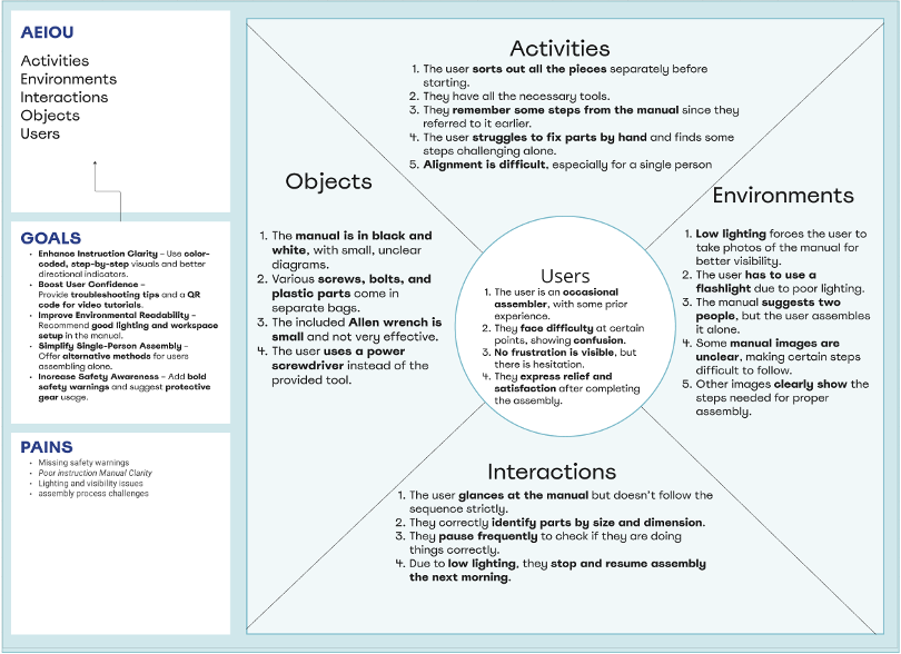
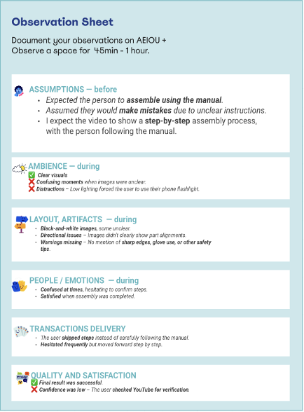
- →Personal story — why manuals fail
- →AEIOU field observation
- →Stakeholder interviews
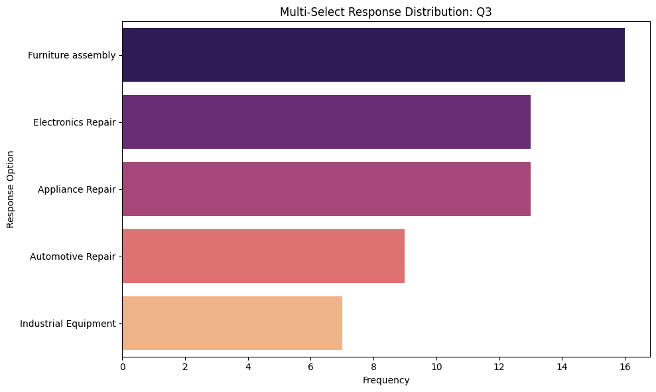
- →Qualtrics survey (18–34 yr olds)
02
DEFINE
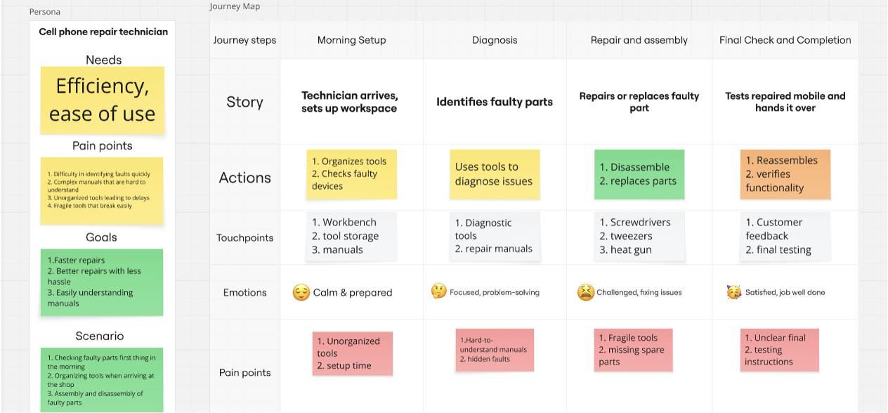
- →Journey map (current vs ideal state)
- →Two personas identified
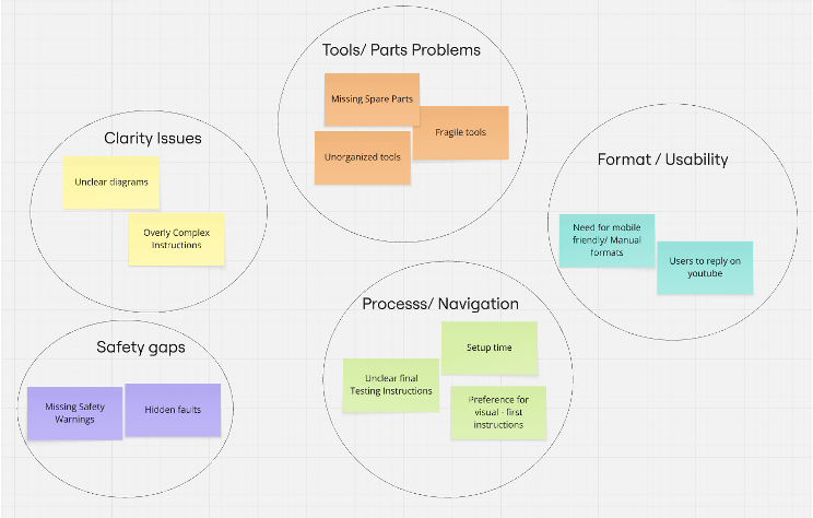
- →Core pain points clustered
- →Problem statement formalized
03
DEVELOP
- →Participatory design sessions
- →Pig drawing test (key insight)
- →Two prototype concepts
- →QR-scan app selected
04
DELIVER
- →Wireframe prototype built
- →Usability testing n=4
- →Think-aloud protocol
- →Iterated on findings
Discover
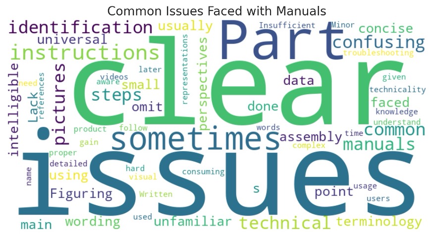
Why Repair Manuals Fail Users
Repair and assembly manuals are safety-critical documents. Yet they're designed like legal contracts — dense text, unclear visuals, buried warnings. When users can't follow them, they turn to YouTube.
⚠
Safety Warnings Overlooked
Small text, inconsistent placement, no visual hierarchy
📖
Technical Jargon Barriers
Language assumes expert knowledge, excludes beginners
📐
2D Diagrams Fail Spatial Tasks
Users can't visualize 3D assembly from flat drawings
🎯
No Learning Flexibility
Text-only format doesn't support different comprehension styles
Persona 1
First-Time Assembler
22, Student
- ✗Confusing images cause frustration
- ✗No clear safety warnings → minor injuries
- ✗Struggles with part alignment
- ✗Relies on YouTube when manual fails
Persona 2
Part-Time Technician
34, Independent Repair
- ✗Different manual formats = inconsistent experience
- ✗Wiring diagrams hard to interpret
- ✗No troubleshooting guidance
- ✗No multilingual support
Define
Journey Map — Current vs Ideal State
| Phase | Current State ✗ | Ideal State ✓ |
|---|---|---|
| Morning Setup | Unorganized tools, long setup time, unclear starting point | Visual checklist, color-coded tool storage, clear workspace setup |
| Diagnosis | Hard-to-understand manuals, hidden faults, no guidance | Step-by-step visual guides, QR code for troubleshooting, color-coded diagrams |
| Repair & Assembly | Fragile tools, missing spare parts, confusing 2D diagrams | Durable ergonomic tools, labeled parts, multi-angle visuals |
| Final Check | Unclear final testing instructions, no pass/fail criteria | Visual checklist, clear pass/fail criteria, completion confirmation |
Develop — Key Insight
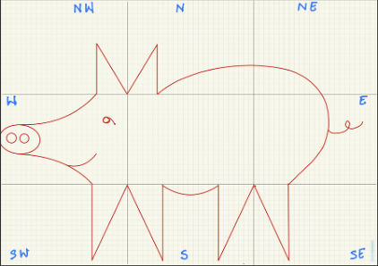
The Pig Drawing Test
We gave participants two different sets of instructions: one text-only, one with visuals. Both described drawing a pig.
The results were stark. Text-only instructions produced chaotic, unrecognizable drawings. Visual-guided steps produced consistent, recognizable results.
Reference: How the pig should look
Target outcome with visual guidance
The actual instructions participants received (text-only condition):
- Divide the drawing area into 9 sections (NW, N, NE, W, Center, E, SW, S, SE)
- Draw a capital "M" at the intersection of North, Center, NW, and West sections
- Draw a curved line from one end of the "M" to the intersection of South and SE sections
- Draw a capital "W" at the intersection of South, SE, East, and Center sections
- Draw another "W" on the South, SW, West, and Center sections
- Join the two "W"s with a curved line
- From the ends of both "W" and "M," draw curves as the pig's nose
- Draw an ellipse joining the curves
- Draw two circles as nostrils inside the ellipse
- Draw a sideways "9" for the eyes
- Draw an elongated "R" in the East section for the pig's tail
→ Result: Every participant produced a different, unrecognizable drawing.
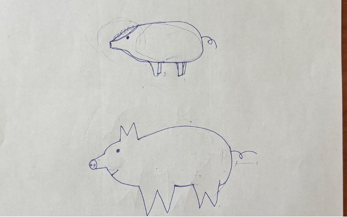
Text-only instructions — chaotic results
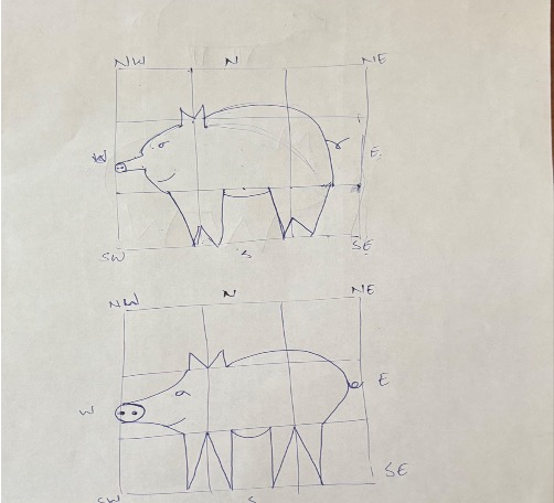
Visual + text steps — consistent, recognizable
Instructions too vague — users can't tell what the product should look like after each step
Too much text, not enough visual guidance at point of need
Switching between formats (text, audio, video) is clunky or missing entirely
Users love clear visuals paired with simple, non-detailed text
Users want control: choose between video, audio, or text based on comfort
Audio guidance noted as beneficial for hands-free operation during repairs
Key Discoveries
What the Research Revealed
Visual-First, Not Text-Heavy
Users consistently preferred images over text paragraphs. Text should support visuals, not replace them.
Evidence: Word cloud analysis: "clarity," "structure," "simplicity" were top demands.
Multimodal Flexibility Required
Different repair contexts demand different formats. Hands-free work needs audio. Complex assembly needs video.
Evidence: Users wanted control to switch between text/audio/video based on task context.
Progress Visibility Essential
Users needed to see "what it should look like" after each step to self-correct errors.
Evidence: Pig drawing test + user testing: "I didn't know if I was doing it right until it was too late."
QR Codes Reduce Friction
Instant access from physical product to digital manual eliminates search time and reduces errors.
Evidence: Users immediately understood QR scan workflow in prototype testing.
Deliver — Prototype
Interactive Repair Guidance System
Users scan a QR code on the product part. The app opens directly to that component's manual — no login, no search, no guessing.
Prototype Screens
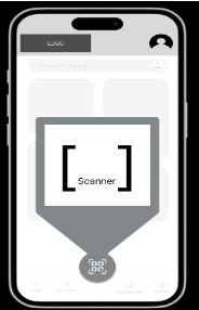
QR scan + format selection screen
Step-by-Step Navigation
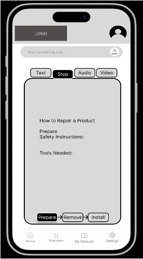
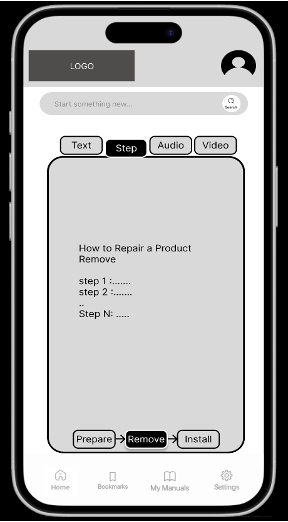
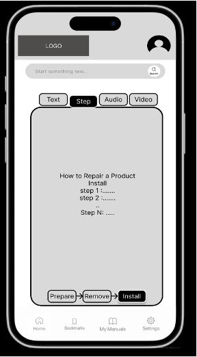
Safety checklist → step-by-step flow
A/B Layout Testing
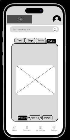
Layout A: Text-first approach
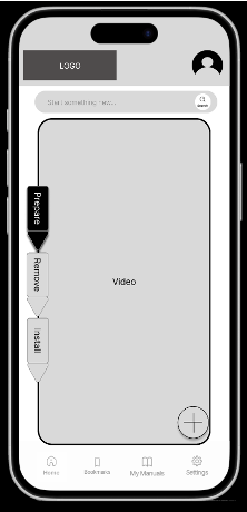
Layout B: Visual-first approach
A/B layouts tested for one-handed phone use during repair tasks
Usability Testing
What We Learned from n=4
Think-aloud protocol, scenario-based tasks, post-task reflection.
"I got a little confused with the tools and safety checklist… maybe we can simplify that process."
Merged into "Preparation Checklist"
"Layout should be compatible with small phones too."
Redesigned for mobile-first layout
"The question mark visually implies being stuck — that's much better than a lightbulb."
? icon chosen over 💡 for help
"If steps are clearly defined, then I don't think that should be an issue."
Confirmed step-by-step structure works
Impact
Why This Matters Beyond One Manual
Better manuals reduce product returns, lower support call volume, prevent user injuries, and support regulatory compliance. This isn't just UX — it's safety, cost savings, and accessibility.
"The best manual is the one users never notice they're following."
🏷
Reduces product returns
Saves company resources
🛡
Lowers injury risk
Supports regulatory compliance
🌍
Supports accessibility
Benefits a broader user base
🔄
Enables iteration
Analytics-driven improvement
Reflection
This project taught me that design research isn't about asking users what they want — it's about watching where they fail and designing systems that prevent those failures. Participatory design revealed problems I never would have found through interviews alone.
The pig drawing test became the turning point: proof that our hypothesis wasn't theory — it was observable truth. One exercise replaced 20 slides of literature review.
Course: HUMF 5874 — Human Centered Design, December 2024