Initiator Fellowship Website Redesign
Accessibility-first redesign bridging WCAG compliance and usable navigation
A potential fellowship applicant visits the Initiator Fellowship website, excited to learn about the program. Within 90 seconds, she closes the tab.
Not because she wasn't qualified. Not because the program wasn't right for her. But because she couldn't find the eligibility criteria.
When we tested the site, this pattern repeated. Every single participant struggled with the same task: figure out if they could apply. The information existed—buried at the bottom of a page, hidden in an FAQ section, wrapped in confusing navigation.
The Usability Crisis
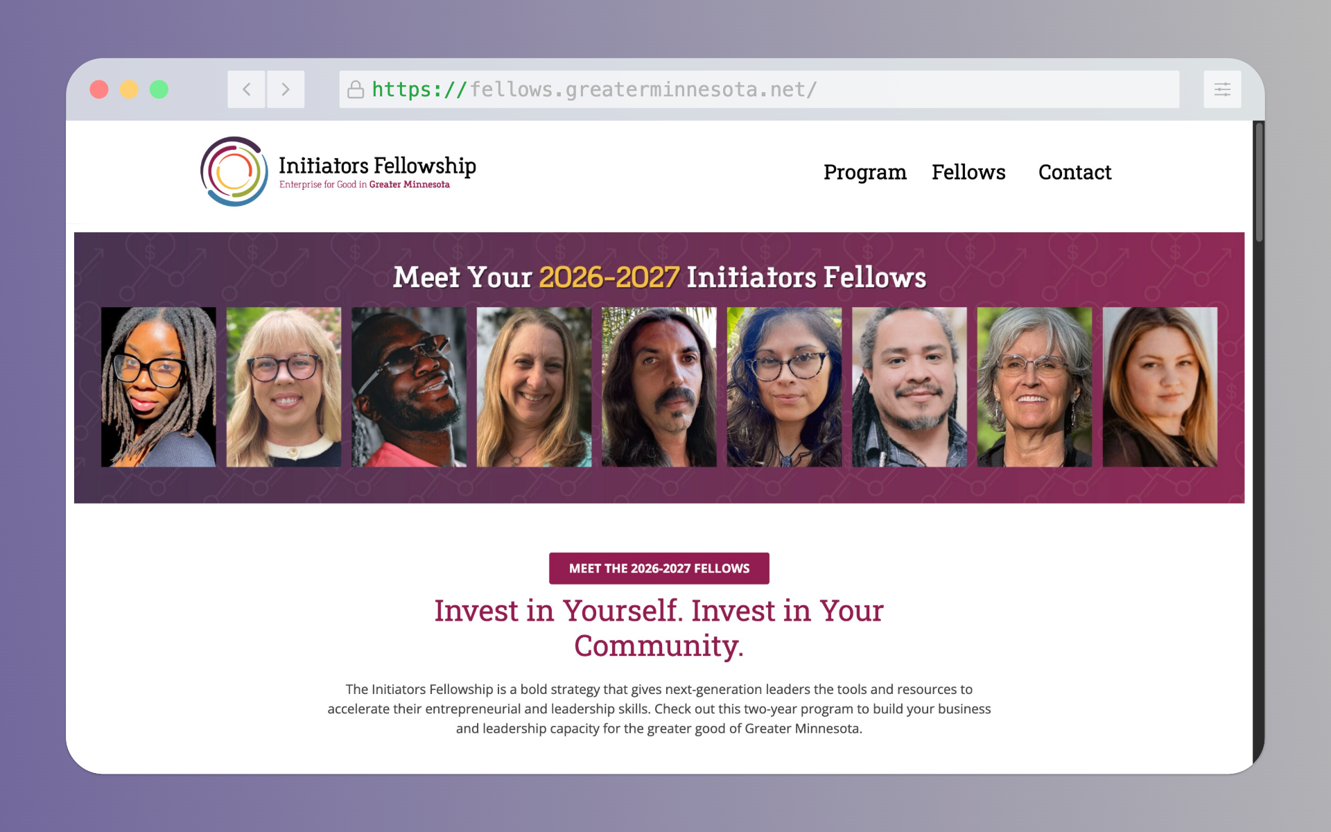
The Initiator Fellowship supports next-generation social entrepreneurs across Greater Minnesota. But the website—their primary recruitment tool—was actively preventing qualified candidates from applying.
WCAG Non-Compliance
Color contrast failures, no accessibility standards met
Hidden Eligibility
Application criteria buried in FAQ at page bottom
Dual Navigation Bars
Confusing layout in half-screen view
No Form Feedback
Users couldn't tell what they did wrong when submitting
.png)
.png)
Mixed-Methods UX Research
We combined heuristic evaluation, task analysis, and user testing to identify root causes—not just symptoms.
Heuristic Evaluation
Applied Nielsen's 10 usability principles. Identified violations across consistency, feedback, and recognition heuristics.
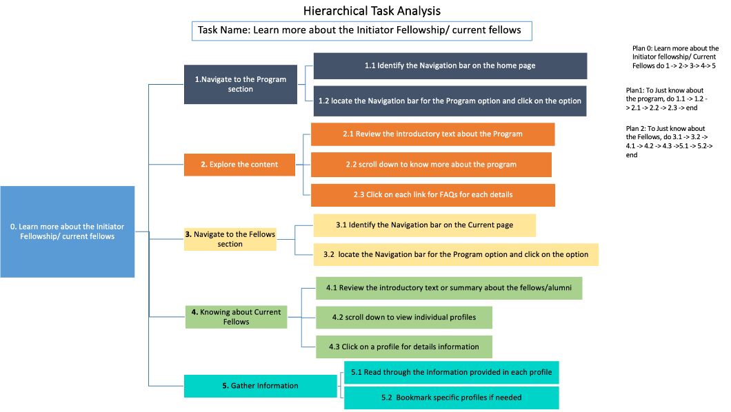
Hierarchical Task Analysis
Mapped 4 critical user flows: learning about fellowship, finding eligibility, applying, contacting staff.
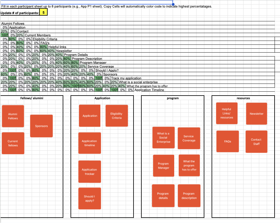
Card Sorting (n=5)
Participants organized content to reveal natural information architecture patterns.
User Testing (n=5)
3 scenarios tested on both old and new sites. Measured task completion time, post-task ratings, qualitative feedback.
.png)
Key Insights
Disconnected Application Process
PROBLEM
Users couldn't track where they were in the application workflow. Timeline, criteria, and tracking were scattered across pages.
SOLUTION
Unified 'Apply' section with integrated criteria, timeline, application form, and tracking—all in one pathway.
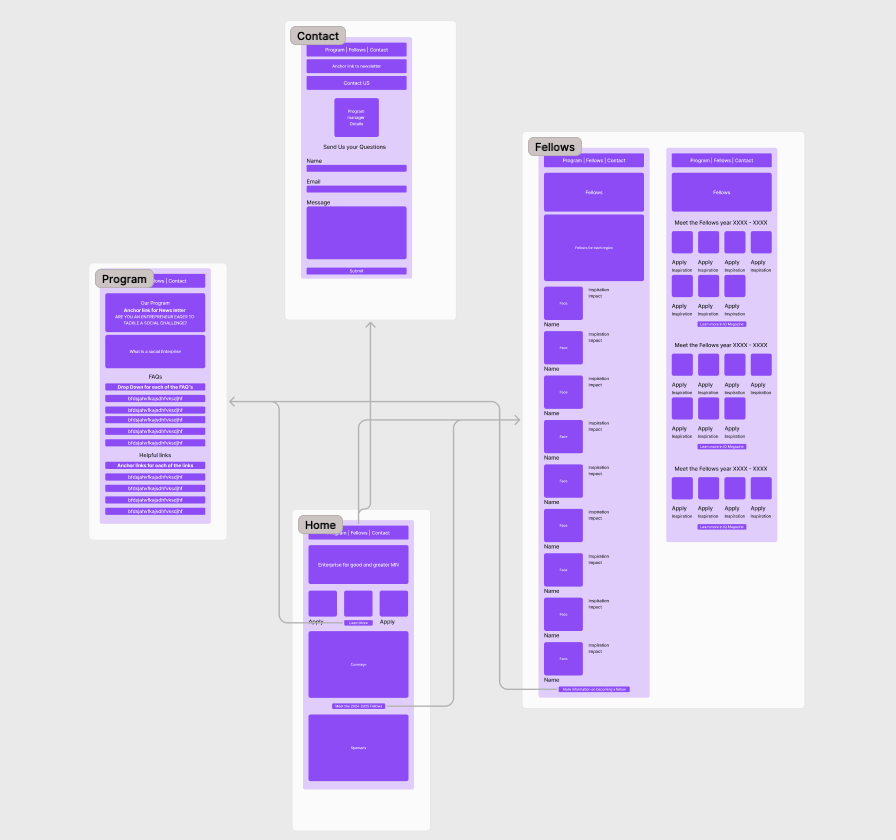
Figure 4.1
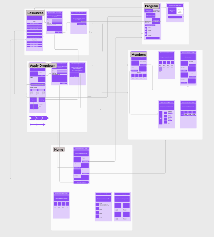
Figure 4.3
Overwhelming Homepage
PROBLEM
Large text blocks, no visual hierarchy. Users couldn't identify what to do first.
SOLUTION
Redesigned as central navigation hub with clear section blocks: Program, Apply, Members, Contact.
Figure 4.5
Figure 4.6
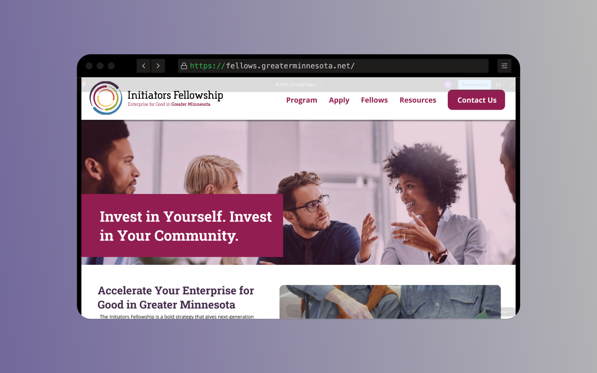
Figure 4.7
Figure 4.8
Hidden Program Details
PROBLEM
Benefits and coverage areas scattered inside long paragraphs across multiple pages.
SOLUTION
Consolidated Program page with structured sections, timeline graphic, bite-sized content chunks.
Figure 4.9
Figure 4.1
Poor Contact Integration
PROBLEM
Program manager info buried in general contact section. No confirmation after form submission.
SOLUTION
Manager details moved to Resources page. Contact Us button in top nav. Confirmation message: 'Message received, response in 2-3 business days.'
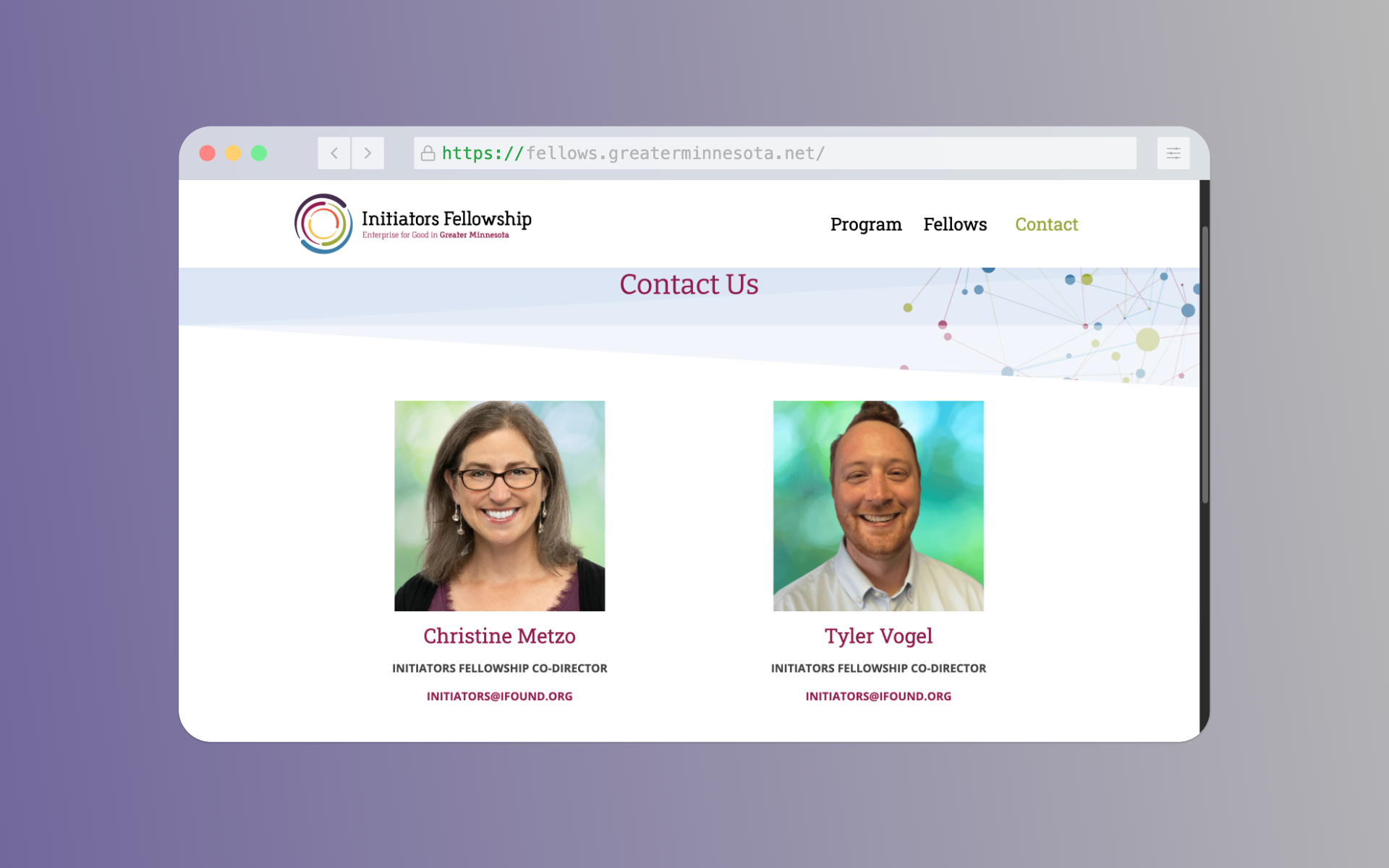
Figure 4.11
Figure 4.12
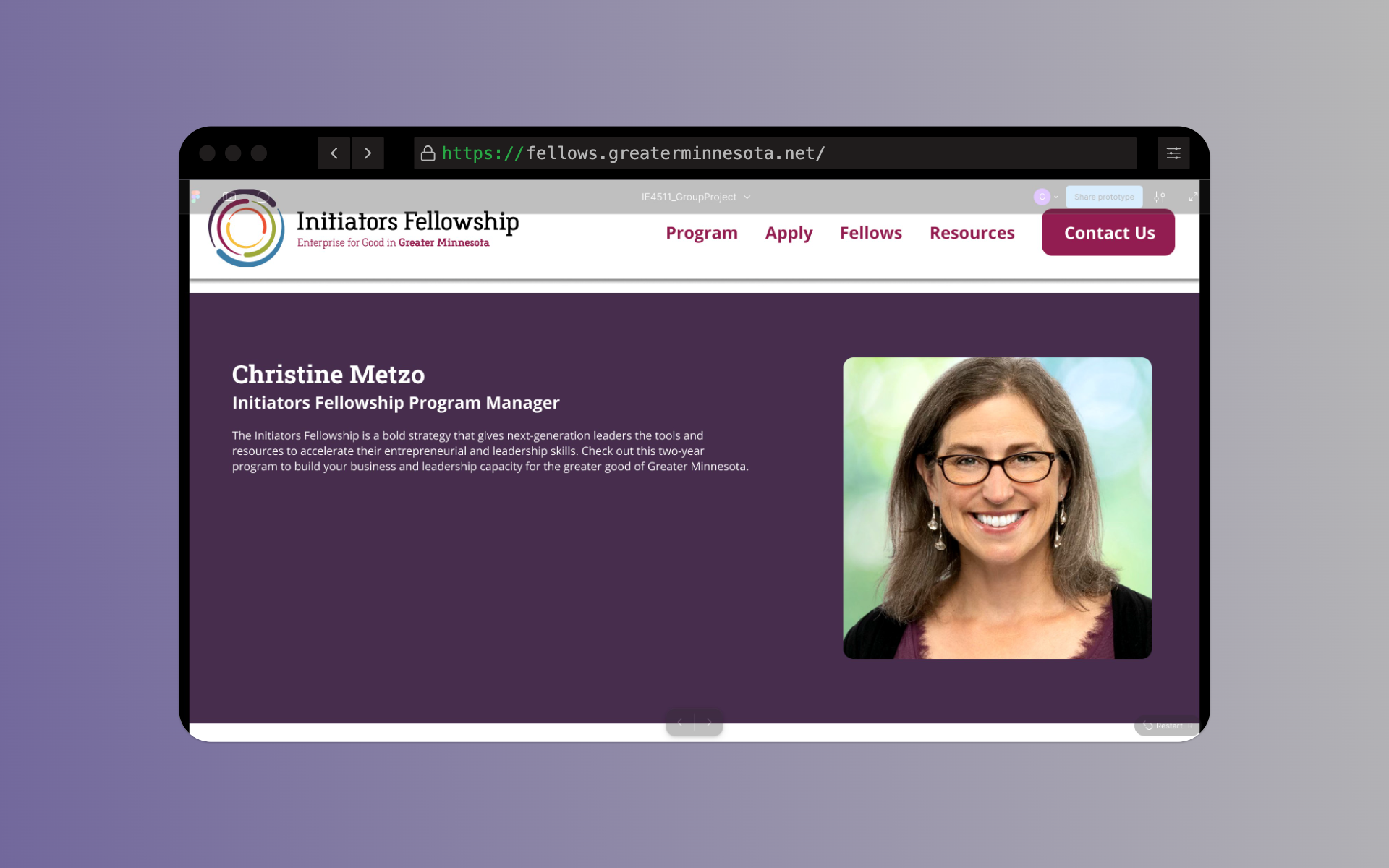
Figure 4.13
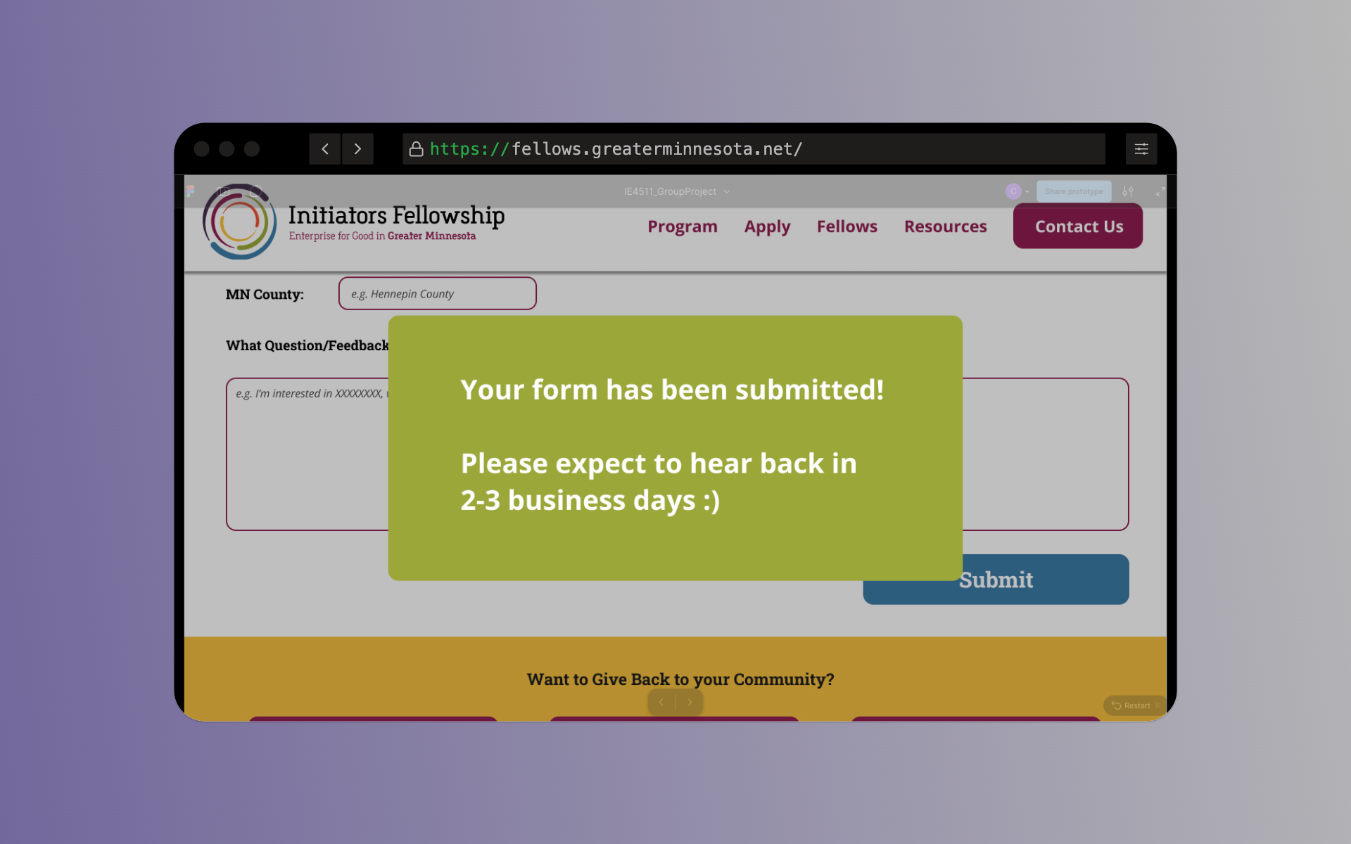
Figure 4.14
Impact Metrics
Average Post-Task Rating Improvement
CHALLENGE
Users rated task ease on the old website at 2.3/5 on average, indicating significant difficulty with navigation and information discovery.
SOLUTION
Redesigned with clear information hierarchy, streamlined workflows, and intuitive navigation to reduce cognitive load.
Measured Impact
2.3/5 → 4.7/5
+104% improvement
Post-task System Usability Scale (SUS) scores across n=5 participants
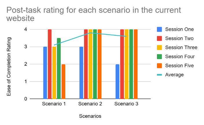
Figure Old Website
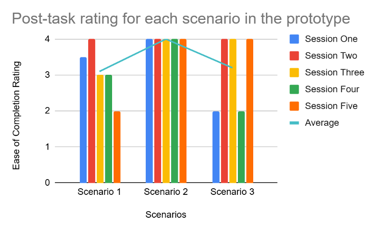
Figure Prototype
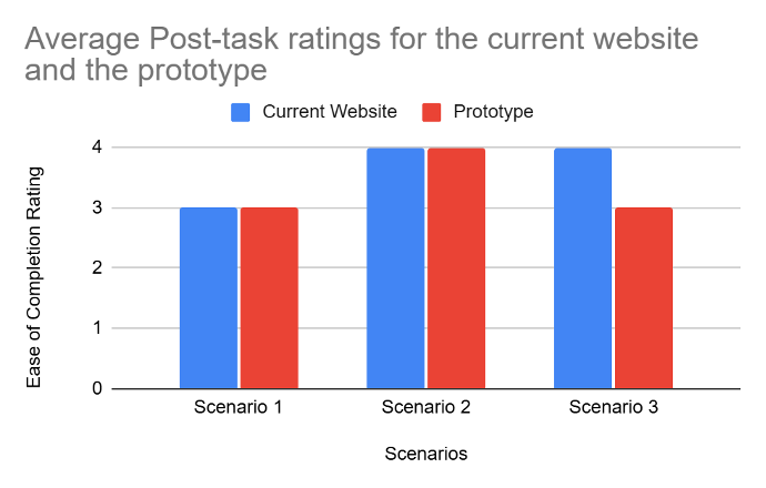
Figure Average
Task Completion Time: Old Website
CHALLENGE
Participants spent excessive time navigating the current website due to scattered information and poor information architecture.
SOLUTION
Consolidated all critical information into unified pathways with clear visual hierarchy and progress indicators.
Measured Impact
Scenario 1: 6m 24s avg
Scenario 2: 4m 18s avg | Scenario 3: 5m 12s avg
Figure Old Website
Task Completion Time: Prototype
CHALLENGE
Initial prototype had some responsiveness issues on smaller screens, but overall performance was significantly better.
SOLUTION
Streamlined application process, integrated eligibility criteria, and unified navigation reduced overall completion time.
Measured Impact
Scenario 1: 2m 45s avg
Scenario 2: 1m 52s avg | Scenario 3: 3m 08s avg (larger due to Macbook screen constraints)
.png)
Figure 5.5
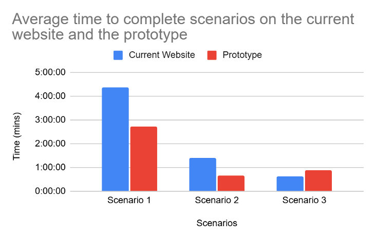
Figure 5.6
Most Impactful Change
"The new site made me feel like the fellowship actually wanted me to apply. Everything was clear, organized, and I knew exactly what to do next."
Participant feedback, Round 3 user testing
What We Shipped
Figma Prototype
Interactive high-fidelity prototype with full user flows
Accessibility Audit
WCAG 2.1 AA compliance documentation
User Testing Report
Complete findings, recommendations, and iteration documentation
HTA Documentation
Task flow analysis for all critical pathways
Interactive Prototype Screens
Designing for Real Impact
This project reinforced something critical: accessibility isn't a checklist—it's a design philosophy. Every decision we made started with "Can someone who needs this fellowship actually use this site?" WCAG compliance was the baseline. Usable navigation was the goal. A 104% usability increase meant we achieved both.
"Good UX research doesn't just find problems. It builds consensus around solutions."
Team: Neha Aramkuni, Vaishnavi Venkatasubramanian, Ajaydeep Singh, Chandan Pai, Vikram Selvakumaranraja
Course: IE 4511 — December 2024